Elevate Your Charting Expertise
This article presents a collection of specialized charts developed over time. The primary objective of any chart is to effectively communicate the story within the data, ensuring it’s easily digestible for the audience. Enhancing charts with interactive elements empowers users to explore data and uncover deeper insights.
Skill Level: Advanced
The charts showcased here represent more sophisticated approaches, extending the capabilities of standard Excel chart types. The aim is to create visuals that are more readable, interactive, and dynamic.
The potential of Excel charts is vast, and this guide hopes to inspire you to create impactful visualizations that reveal the hidden narratives in your data.

Below is a curated list of the ten charts discussed in the video. Each entry includes a concise description of the chart, its suitable data types, and a direct link to comprehensive tutorials for creating and implementing these charts in your own projects.
1. Column Chart Displaying Percentage Change
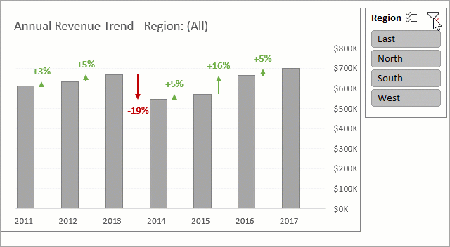
Data: Longitudinal Data
Use: Visualize percentage change across time or event sequences.
Tutorial: Master Column Charts for Percentage Change and Variance
Description: This chart features arrows and percentage change values between each column, illustrating the variance between consecutive periods. The arrows and text are conditionally formatted to reflect positive or negative variances through color changes.
This dynamic chart adapts when the data is filtered, and the title reflects the currently selected region.
2. Progress Doughnut Chart with Conditional Formatting
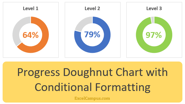
Data: Goal Attainment
Use: Illustrate percentage completion, utilizing conditional colors for tracking progress.
Description: This distinctive doughnut chart utilizes color changes to signify progression towards milestones, enhancing visual assessment of goal achievement.
3. Interactive Histogram Revealing Data Details
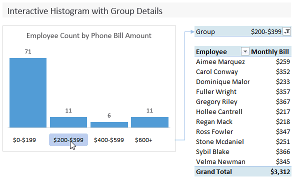
Data: Categorized Data
Use: Show the count of elements within each category alongside detailed reports for selected groups.
Description: Clicking on the dollar ranges below each bar activates a slicer, revealing a pivot table that details the entries comprising that specific data set. This interactive chart excels at providing granular insights while maintaining the overall context.
4. Dynamic Histogram for Frequency Distribution
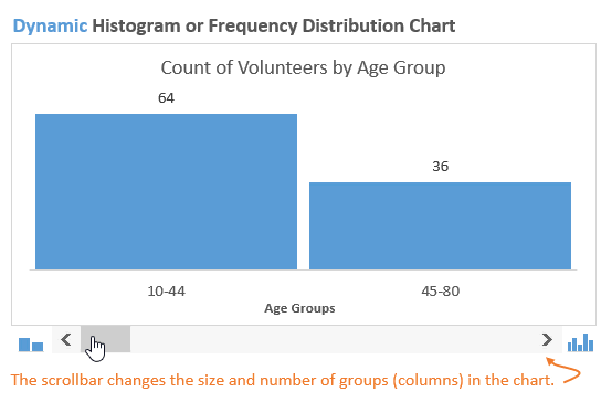
Data: Categorized Data
Use: Adapt group sizes to unveil different aspects of the data.
Tutorial: Design a Dynamic Histogram to Analyze Data
Description: This histogram features a scroll bar that allows for adjusting the number of groups, presenting various interpretations of the data as the range is modified.
5. Annual Trend Analysis with Monthly Breakdowns
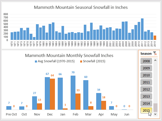
Data: Longitudinal Data
Use: View trends within trends and benchmark against historical averages.
Tutorial: Compare Monthly Averages Against Current Year Trends
Description: Simultaneously visualize data trends across two different time scales (years, quarters, months, etc.), and compare them with historical performance averages.
6. Interactive Waterfall Chart for Data Flow
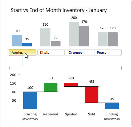
Data: Time-based Data, Inventory, CRM, Pipeline Metrics
Use: Detail the incremental changes in values over time.
Tutorial: Create an Interactive Waterfall Chart Dashboard
Description: This mini-dashboard illustrates the factors contributing to the change between a starting and ending value, highlighting the additions and subtractions that occurred along the way.
7. Variance Display on Clustered Charts
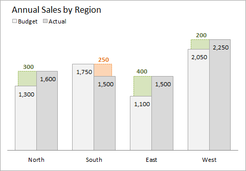
Data: Categorized Data
Use: Compare variance between two categories across multiple series.
Tutorial: Visualize Variance in Clustered Charts for Target Comparison
Description: Enhancing standard clustered charts, this technique displays the variance between bars with conditional formatting, differentiating positive and negative changes through color.
8. Actual vs. Multiple Targets in Charts
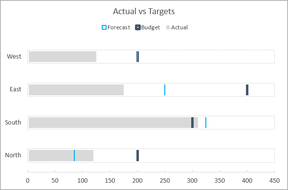
Data: Categorized Data
Use: Compare performance against multiple benchmarks or goals.
Tutorial: Showcase Performance Against Multiple Targets
Description: These charts juxtapose a single data point against numerous targets (budget, forecast, goal, etc.), providing a clear view of performance against objectives. Displayed horizontally or vertically, they can also include percentage attainment metrics.
9. Stacked Bar with Dynamic Labels

Data: Longitudinal and Categorized Data
Use: Enhance readability of stacked charts by dynamically switching data labels.
Tutorial: Customize Dynamic Chart Data Labels Using Slicers
Description: Recognizing the challenges in interpreting standard stacked bar charts, this solution allows dynamic data label changes to improve series comparison within the bars.
For alternatives to stacked bar charts, such as a panel chart, checkout this post: Stacked Column Bar Chart Alternatives – Find the Missing Trends.
10. Comparative Distribution Analysis
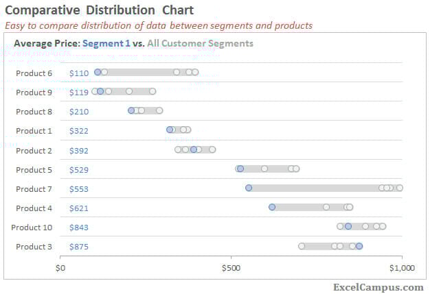
Data: Categorized Data
Use: Contrast a particular segment against others across different series.
Tutorial: Analyze Comparative Distribution as a Histogram or Box Plot Alternative
Description: This chart facilitates comparing values across segments and categories, offering a compelling alternative to quartile plots or multiple histograms.
Bonus: Macro for Chart Zoom Functionality
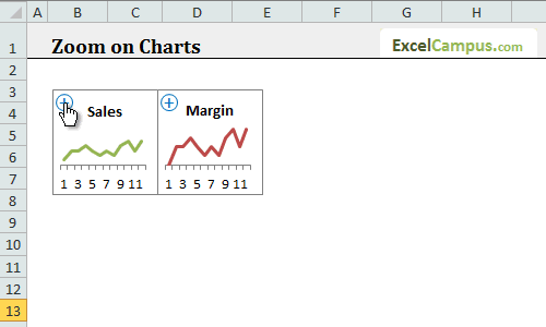
Data: Any
Use: To enhance readability of small charts densely packed on a dashboard or sheet.
Tutorial: Implement Chart Zoom Functionality
Description: This macro adds a button to charts for easy zooming, enabling users to focus on one chart at a time within a multi-chart layout.
In Conclusion
Hopefully, these advanced charts have inspired you to explore creative data presentation methods and unlock the stories hidden within your datasets through visualization. Subscribe to our Free Excel Pro Tips Newsletter for weekly insights and tutorials to elevate your Excel expertise.
Until our next encounter, enjoy charting! 🙂